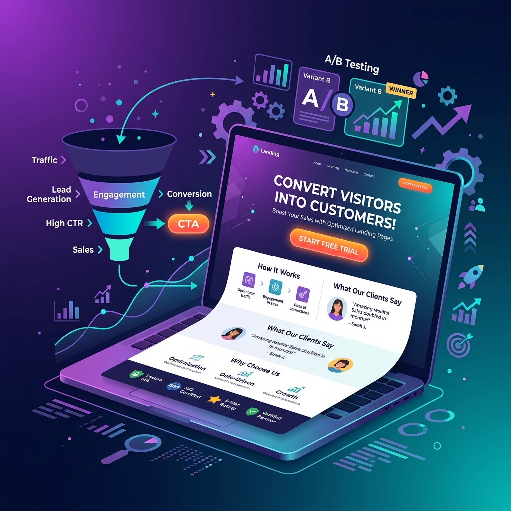
1. Master Your Headline — It Determines Whether Visitors Stay or Leave
You have approximately 5 seconds to convince a visitor to stay on your landing page. Your headline does most of that heavy lifting. The most effective landing page headlines in 2026 follow a clear formula: Lead with the result or transformation your visitor wants, not the feature or process you provide.
- ❌ “Professional Web Design Services”
- ✅ “Get a Website That Generates 3x More Leads — in 30 Days”
- Use specifics — numbers, timeframes, and results outperform generic claims by 2–4x in A/B tests
- Match the emotional state of your visitor — are they frustrated, hopeful, or skeptical?
2. Nail Message Match Between Ad and Landing Page
Message match is the most commonly overlooked conversion optimization. The language in your ad headline should appear almost identically in your landing page headline. When a visitor clicks “Best HVAC Installation Sacramento” and lands on a page about “HVAC Services” — there’s a mismatch that triggers doubt and increases bounce rates. Perfect message match can improve conversion rates by 50–200%.
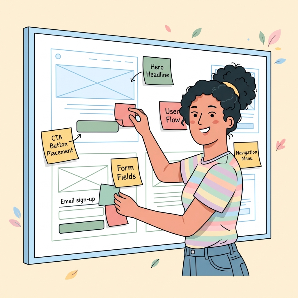
3. Design Your Above-the-Fold Section for Maximum Clarity
Everything visible before a visitor scrolls is your above-the-fold section. It should contain: a compelling headline, a supporting subheadline clarifying your offer, a visual that reinforces the message, and a clear primary CTA. Remove anything that doesn’t serve these four elements. Clutter above the fold kills conversion rates.
4. Use One Primary CTA — Eliminate Competing Actions
Multiple CTAs create decision paralysis. Landing pages with a single focused CTA convert at an average of 13.5% compared to 11.9% for pages with two or more CTAs. Repeat your one CTA at the top, middle, and bottom of the page — but always the same action. The only exception: a secondary “Chat with us” option as a lower-commitment alternative for visitors not ready to convert.
5. Write CTA Copy That Communicates Value, Not Generic Action
- ❌ “Submit” — the lowest-converting CTA in history
- ❌ “Click Here” — marginally better, still weak
- ✅ “Get My Free Quote” — personalizes and leads with value
- ✅ “Start Saving on Energy Bills Today” — leads with the outcome
- ✅ “Claim My [Offer]” — creates ownership and urgency
Button color matters less than contrast with the surrounding page — your CTA must visually pop as the most attention-commanding element in its section.
6. Optimize Your Form for Minimum Friction
Every additional field you add to a form reduces conversion rates by an average of 20–25%. Ask for only the information you absolutely need to move the lead forward. For most B2B leads, name + email + phone is the maximum for high conversion. For e-commerce, card number + email is the minimum viable checkout. If you need more information, collect it after the initial conversion via a multi-step form — the completion rate of step 2 is significantly higher than getting people to start a long form.
7. Place Social Proof Strategically — Not Just Anywhere
Social proof works best directly adjacent to your primary CTA and at moments of potential hesitation (just before a form). Common high-converting social proof elements:
- Star ratings with review count: “4.9 ★ (650+ Google Reviews)”
- Customer photos + first name + specific result achieved
- Client logos (especially recognizable names in your industry)
- Specific metrics: “Helped 1,200 businesses in Sacramento grow revenue”
8. Use Real Photos, Not Stock Photography
Stock photos reduce conversion rates. Real photos of your team, your product, your office, and your actual customers increase trust and conversion. In 2026, visitors instantly identify and distrust generic stock imagery. A low-quality but authentic photo of your real team outperforms a polished stock photo of a smiling model every time.
9. Remove Top Navigation from Landing Pages
Navigation menus give visitors a way to leave your page without converting. Remove the main site navigation entirely from dedicated landing pages — this simple change increases conversion rates by an average of 28% in controlled tests. Keep only your logo (linking to home) and a direct contact option (phone number or chat).

10. Optimize Page Speed Until You Score 90+ on PageSpeed Insights
A 1-second delay in load time reduces conversions by 7% on average. On mobile, 53% of visitors abandon pages taking over 3 seconds. In 2026, page speed also impacts your Google Ads Quality Score — a slow landing page increases your cost per click by 5–15%. Quick wins: compress images to WebP, defer non-critical JavaScript, use a CDN, and eliminate render-blocking resources.
11. Display Trust Badges and Accreditations
Trust badges near your CTA and form reduce conversion anxiety — the hesitation visitors feel right before committing. For service businesses: license numbers, insurance badges, BBB accreditation, and industry certifications. For e-commerce: SSL seal, secure payment icons, money-back guarantee badge, and free shipping/returns indicator.
12. Proactively Address Your Visitors’ Top Objections
Identify the 3–5 most common reasons people don’t convert and address them directly in your page copy. “Is this worth the cost?” “Will this work for my specific situation?” “What happens if I’m not satisfied?” Visitors who have their objections answered convert. Visitors who don’t find answers leave. Your FAQ section (Tip #18) is the right place to handle these systematically.
13. Use Authentic Urgency and Scarcity
Urgency and scarcity increase conversion rates — but only when they’re genuine. Fake countdown timers that reset and “only 3 spots left” that never change destroy trust the moment visitors notice. Authentic urgency examples: a real limited promotion window (“This offer expires Friday”), genuine limited capacity (“We only take on 5 new web design clients per month”), and seasonal relevance (“Heating season starts in 6 weeks — book now for priority scheduling”).
14. Design Mobile-First, Then Scale Up
Over 70% of landing page traffic arrives on mobile in 2026. Design your page for a 390px-wide screen first — if it converts on mobile, it will absolutely convert on desktop. Common mobile killers: text that’s too small (minimum 16px body text), buttons that are too small to tap (minimum 44px height), forms that require horizontal scrolling, and images that block the CTA.
15. Add a Conversion-Optimized Video to Your Hero
A well-placed explainer or testimonial video can increase landing page conversion rates by 80% (Unbounce benchmark data). The video should: be under 90 seconds, auto-play muted with captions, appear above the fold or immediately below the hero CTA, and present one clear message — a customer result or a direct product/service demonstration. Do not include a talking-head brand introduction as your primary video.
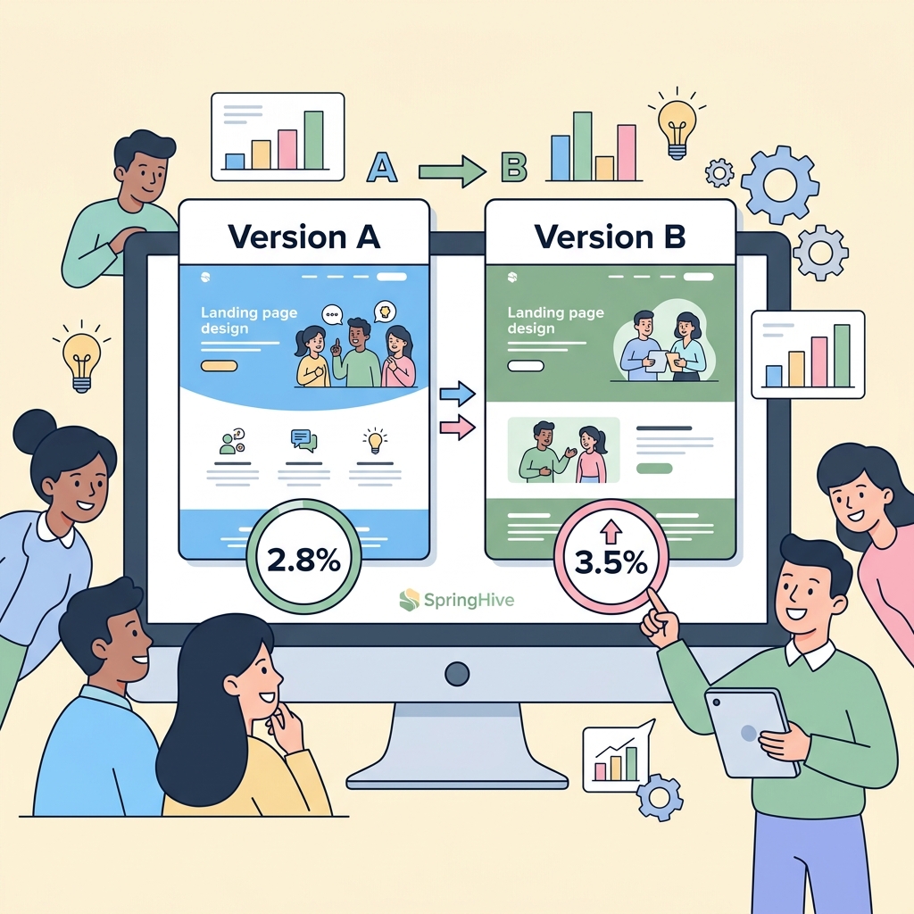
16. A/B Test One Element at a Time
Never change multiple elements simultaneously — you won’t know what drove the improvement. Test in priority order: headline (highest impact), CTA copy, CTA button color/size, hero image or video, and form length. Run each test until you reach statistical significance (minimum 300–500 conversions per variant). Use Google Optimize or any modern CRO platform for proper split testing.
17. Lead With Benefits, Follow With Features
Visitors care about what your product or service does for them, not what it technically is. Benefits → Features → Proof is the copywriting hierarchy that converts. “Reduce your energy bill by 35%” (benefit) → “Using our 5-layer insulation system” (feature) → “As seen in 1,400 installations this year” (proof). Most landing pages invert this order and lead with technical specifications — a common conversion killer.
18. Include a FAQ Section to Pre-Handle Objections
A well-crafted FAQ section near the bottom of your landing page serves three functions: it handles objections before they become abandoned conversions, it adds keyword-rich content that improves organic ranking, and it provides FAQ Schema markup opportunities that earn rich results in Google Search. Limit to 4–6 questions that directly address the biggest hesitations your sales team hears regularly.
19. Implement Dynamic Personalization
In 2026, visitors increasingly expect landing pages that speak to their specific situation. Dynamic text replacement (DTR) tools allow you to change your headline and CTA based on the ad keyword that brought them to your page — automatically. A visitor who clicked “HVAC repair Sacramento” sees “HVAC Repair in Sacramento” as the headline, while someone who clicked “AC installation” sees “AC Installation Expert — Sacramento.” This single tactic routinely lifts conversion rates by 15–35%.
20. Track the Metrics That Actually Matter
Most marketers watch traffic and bounce rate. The metrics that actually diagnose conversion problems:
- Scroll depth: What percentage of visitors reach your CTA? (Use GA4 scroll tracking)
- Click-to-form-start rate: Of visitors who click the CTA, what % start filling the form?
- Form completion rate: Of visitors who start the form, what % submit?
- Conversion rate by traffic source: Paid vs. organic vs. email often convert at radically different rates — optimize each separately
- Cost per lead (CPL): The ultimate profitability metric — not conversion rate alone
SpringHive designs and optimizes conversion-focused landing pages for businesses in Cebu and Sacramento. From PPC landing pages to full CRO audits, we help you extract more revenue from your existing traffic. View our CRO service or get a free landing page audit.